Hospital signage is wayfinding first and branding second. People arriving at Carteret Health Care are often having a bad day already; the signs are how they find the right entrance the first time. That is a different standard than retail, and it shapes every decision from letter height to LED brightness.
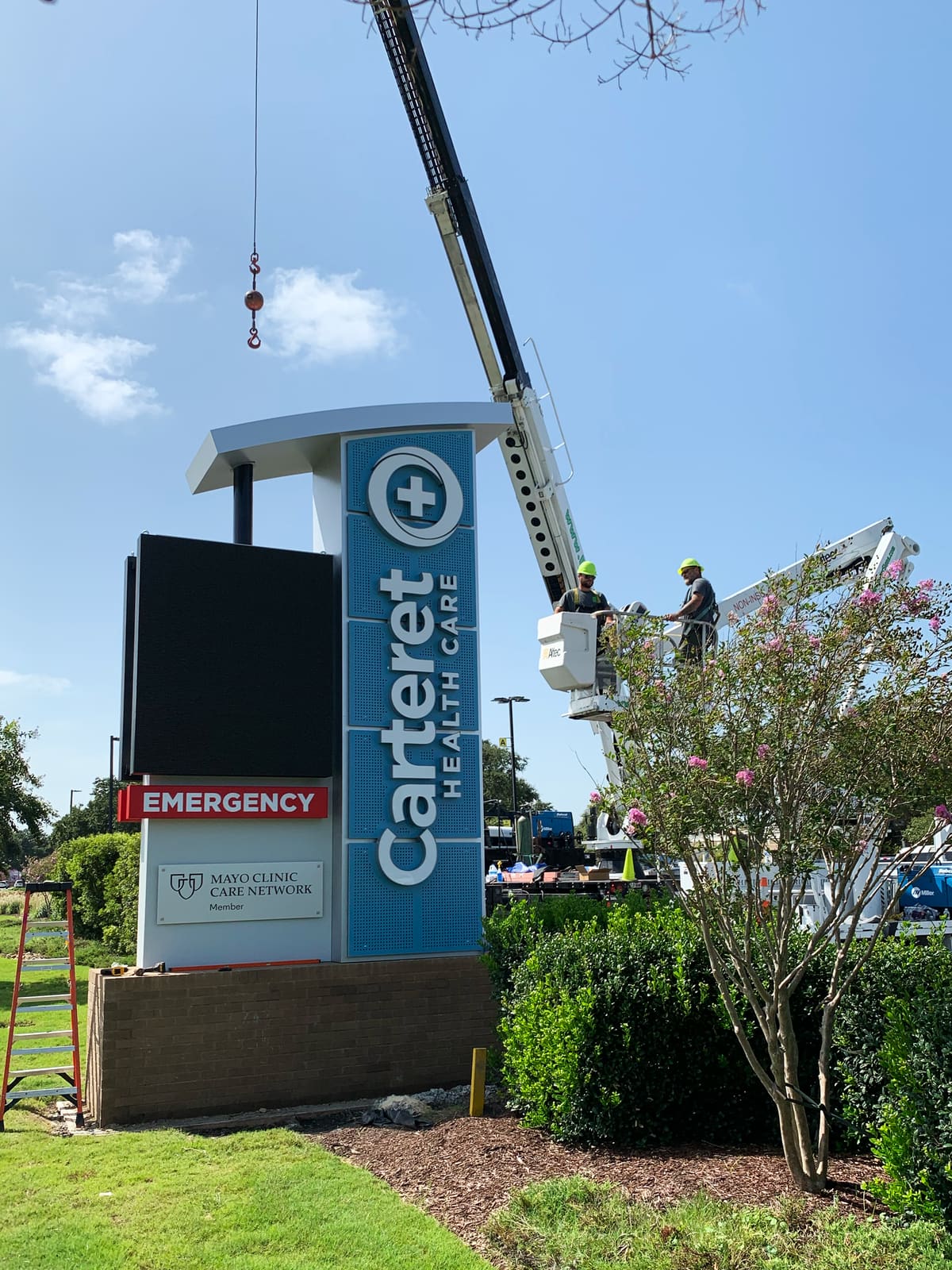
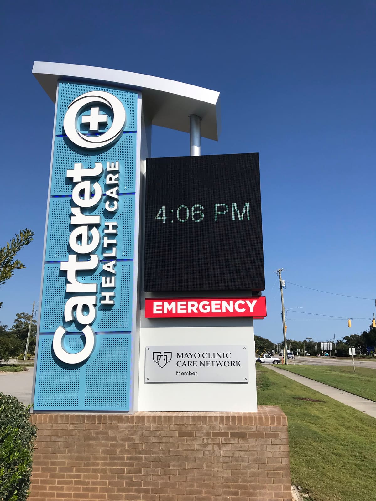
The program at the Morehead City campus ran on three tracks. The headline piece is the new tower monument at the main entrance, an LED message board under the health system’s name, carrying the Mayo Clinic Care Network plaque. Around it, the existing campus signs were refurbished rather than replaced: recased, refaced, and relit where the structures were still sound, which is real money a campus doesn’t have to spend twice. And on the buildings themselves, new channel letter sets went up, fabricated in our Pollocksville shop along with the campus wayfinding panels.
Salt air is the quiet constraint on the Crystal Coast: coatings, hardware, and cabinet drainage all spec’d for it, or the sign chalks and streaks in three summers. Ours are spec’d for it. For hospital systems and clinic networks, this is the model — one shop that can build new, refurbish what’s worth keeping, and install around your operations without interrupting them.